The cliché about things designed by committees is going to have to be
rethought. The committee in charge of deciding what’s going to be built on the
World Trade Center site today announced its two
finalists – and they were about as bold and visionary as you could
get. And it wasn’t a committee of avant-garde architects, either: it included
representatives from New York City, New York State and even that epitome of
unimaginative conservatism, the Port Authority of New York and New Jersey. The
decision, it’s worth mentioning, was unanimous.
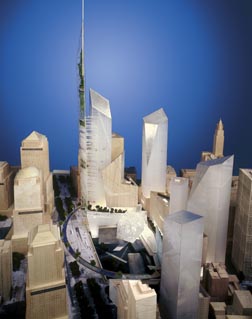
The committee, in fact, has chastened me into taking one of its finalists seriously.
When I first saw it, I said
that the Think plan for a World Cultural Center was "a crazy idea."
Just for good measure, I added that "This is a flight of fancy, it could
never happen."
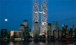
I was wrong. It turns out that the plan, for all that nothing like it has ever
been seen before, is actually eminently practical. The idea behind the World
Cultural Center is to separate culture from commerce: to build around the footprints
of the World Trade Center, but this time filling the space with theatres and
libraries rather than salarymen and offices.
Two latticework towers, the tallest structures in the world, will rise where
the World Trade Center once stood – surrounding, but never touching, the
twin towers’ footprints. At ground level, there may or may not be reflecting
pools, but there will certainly be memorials below grade. High up in the sky,
at the points where the planes hit, there will be another memorial.
The innovative ideas in this project are breathtaking: the fact that wind passes
straight through the latticework, for instance, allows Think to install wind
turbines which will generate enough power to run the whole elevator system.
The engineering is extremely solid, and is designed to stay standing even if
large chunks are vaporised; furthermore, because the latticework is made of
huge steel beams, it’s more likely to break anything crashing into it, rather
than be broken.
These towers are light, in many senses: open to light and the air, they are
tall, but don’t cast oppressive shadows. They also keep the towers of light
which so touched New Yorkers last year: beams can be sent up through the latticework
and up to the heavens, this time exactly where the World Trade Center once stood.
Best of all, this plan, uniquely among the nine shortlisted proposals, would
restore the skyline almost immediately. The latticework towers would start going
up as soon as their foundations were finished, without having to wait for the
New York real estate market to pick up and anchor tenants to be found. The response
I’ve heard most often to the idea of putting towers back on that site is "who
would ever want to work there?" – here, you have the towers, but
precious few workers.
What’s more, even though the concept emphasises the triumph of art over commerce,
there’s still lots of land left over for offices and retail. In fact, the Think
team has kept very much to the spirit of the competition, and simply indicated
where the offices are going to go, without even vaguely trying to show what
they might look like. Larry Silverstein can build what he likes: because the
memorial and the heart of the redesign is concentrated within the area bounded
by Greenwich, Fulton, Liberty and West Streets, everything else in the 16-acre
site can be very close to New York real estate development as usual.
What that does mean is that this plan, almost uniquely among the leading candidates,
has relatively little in the way of parkland or open space. Think has taken
city streets and made them vertical: piling buildings (to be designed by a variety
of architects) on top of each other rather than alongside each other. The space
is up in the sky, not down on the ground. It’s a radically new vision for the
new century, and New York would be the envy of the world were it to play host
to it.
 Daniel
Libeskind (I guess I ought to be spelling his name right now he’s a finalist:
I always thought it was Liebeskind), on the other hand, is now in the rather
unusual – for him – situation of being the conservative choice.
I loved his plan when he first announced it, and I still do: it will create
one of the world’s great public spaces, at the center of which will be a very
powerful memorial descending into the ground.
Just how far the memorial will descend is not entirely clear, however. Many
family members appreciated the raw nature of the space, and the fact that the
memorial site would be down in the foundations of the towers, 70 feet below
ground. But that might be impractical, for engineering reasons: the slurry wall,
which is a vital centerpiece of the Libeskind design, was not designed to hold
back the Hudson River without heavy foundations on its eastern side. So the
base of the memorial might have to be moved up a bit, something Libeskind is
fine with.
Either way, the Libeskind design is one of the most coherent and stunning.
The passage out from the bottom of the memorial to the top of the Gardens of
the World, 1776 feet up in the air, will be a magnificent and moving journey.
Moving around the site is intuitive and easy, and the transport hub is extremely
impressive.
Choosing between these two designs will not be easy. I strongly urge you to
check them both out and let me – and the Lower Manhattan Development Corporation
– know what you think. Ultimately, however, I think the final choice is
going to be determined by how much ambition the public sector has.
The Think design is far from being a waste of money. West Street remains just
as it is: for the amount of money that other plans spend on either burying or
covering it, Think can build its towers. And in fact, in many respects the two
proposals are the same: the site and size of the memorial, what to do with West
Street, where to put the transit hub, that sort of thing. As far as land use
goes, the decision has pretty much been made. Nevertheless, the Think proposal
is a lot more expensive than that of Libeskind, who calls his proposal "bargain
basement".
While there might be some private-sector sponsorship of cultural institutions
inside the Think latticework towers, they will still have an up-front cost to
the public sector of many hundreds of millions of dollars. And while the Think
towers would go up very quickly, the Libeskind spire wouldn’t rise until Phase
III, which could be a decade hence, if it happens at all.
So while my original reaction to the plans was to prefer Libeskind to Think,
I’ve now changed my mind. Libeskind is architecture we know: modern, avant-garde
architecture, which can be very good but which isn’t going to change the way
that people think about what’s possible and what buildings can be and represent.
The Think plan, on the other hand, turns whole groupings of buildings into a
living memorial, with books and theatre and dance and vibrancy, something visible
from all over New York, and something which, if it’s chosen, will actually get
built.
Be bold, I say. Think Think.


Good arguments, Felix, but I still can’t get over my first impression, which is that Think’s plan reminds me of two huge pipes clogged with debris. Of the two, I have to say I prefer Libeskind’s, which is not quite so violently out of context…
Being afraid of heights, I don’t think you’d ever get me up to the top of the Think memorial. It’s an innovative idea, and I love the library, theater, etc. – NYC should have all of that downtown at the site anyway, because there needs to be a draw for New Yorkers to visit the area beyond a memorial site. I imagine I would visit a memorial site on occassion, but going to the theater? Now that’s something I do on a regular basis. Plus, it would be nice to have a cultural space downtown that is not Lincoln Center or BAM. That kind of thing really draws New Yorkers to the space – and would bring life back into a very melancholy area… and would be good energy for the working force of downtown.
In practicality, it seems Think has done a solid job of considering every aspect. The problem is, I’m not crazy about the steel towers and the beams of light shooting from the top. Every time I would see those lights from any given area in lower Manhattan, I’d think of the WTC disaster. I don’t need to be constantly reminded of that, I saw it just like everyone else and my memory is enough weight.
If Think could work out a few kinks – perhaps the design would work… I really like Libeskind’s proposal – so if that goes through, I wouldn’t be upset. It’s graceful and elegant. But would it take 10 years to build? Ugh, I’ll be 41! Too long – the economy, the revitalization of the area and our community needs something to be constructed sooner rather than later…
I find the Think tower and your site equally slick and innovative. I do enjoy creative people!
think=theme park
‘opera house’??? ‘library’??? ‘theatre’???
one stop cultural shopping.
slap a ‘Lowes WTC’ a ‘Hard Rock Ground Zero’ in there and that project just might be finished.
the tourists will love it!
and where are the office buildings?
oh… thats right they’re those undefined blocks that in the model look exactly like all the intentionally ‘faceless’ blocks in the model.
I guess thats ok though… the last batch of faceless office space that was put up in this city on a ‘as needed’ basis (read- spec) has worked out quite well. All the buildings are about 30 years old, and are being gutted down to the steel for rebuilds.
So 2040, we get to rebuild the ‘office space’ of the Think plan again. Now thats an urban design feature!
Maybe by then, we can link the ‘office space’ to the ‘cultural center’ by rollercoaster and really tie the whole site together.
Can’t imagine how anything would connect, work, in the Think, but I like your picture and description of it. Have absolutely no opinion of my own. Can’t visualise the finished product. Just wanted to write how much I enjoyed both your entries on the redevelopment, was the first one before Christmas? No wonder I didn’t get around to posting a comment! Great way of staying a little bit informed of what is happening in your part of the world.
mum
the think plan looks like a couple of ghost towers, which is a little freaky to me. go with the libeskind plan.
The decision has been made….would like to see it in detail.
When I look down at the plan I really get confused. There is to much glass. If the plan is
going to be build something may go wrong. Like windows getting broken or if we have another terrorist attack. There would be glass falling down. Just imagine, there would be to much chaos. And us people don’t want that. I am 100% my designs will work. I been working on them for 3 months.