The design for the Freedom Tower – the big signature building which is
to rise at the northwest corner of the World Trade Center site – was unveiled
with great pomp today. Grand speeches were given by George Pataki, Michael Bloomberg,
Larry Silverstein, Daniel Libeskind, and, of course, the architect, David Childs.
But what’s the tower like? Is it a magnificent structure the like of which
the world has never seen, a skyscraper to put New York City back in its rightful
place as the home of the greatest tall buildings in the world? After all, a
central part of the WTC redesign has always – since long before Libeskind
was chosen as the master architect for the site plan – been the restoration
of the skyline. And although this building certainly puts something tall where
(more or less) the Twin Towers once stood, I’m not sure that it really has the
kind of iconic power that the most optimistic of us were hoping for.
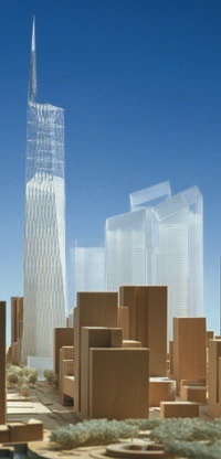
The Freedom Tower is not an easy structure to get your head around. For one
thing, it kindasorta torques, which means that its shape can’t be easily described
or conceived. And then it’s basically comprised of three unrelated elements:
an office block at the base, with a latticework structure on top of that, and
finally a 276-foot spire perched on the very top.
It’s designed by David Childs, a competent architect with, as far as I can
make out, no real genius or inspiration whatsoever. In New York, he has built
perfectly good structures like the New York Mercantile Exchange and the Stuyvesant
School Bridge, both very close to where the Freedom Tower will be built; mediocre
buildings like the Bear Stearns headquarters; and, of course, the monstrosity
that is the Time Warner Center at Columbus Circle. This is not the kind of man
who will think outside the box: he more or less invented the box as we know
it today.
The base of the building has been evened out from Libeskind’s original, angular
design, and is now a perfect parallelogram, mirroring the street grid around
it: West Street on the west, Vesey Street on the north, Fulton Street on the
south, and maybe some kind of extension of Washington Street on the east.
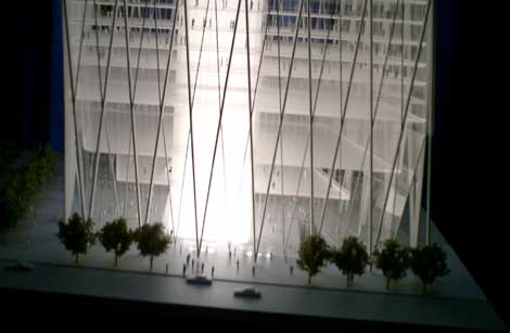
The base is actually the best part of the building, echoing the extra-high
bases of the original World Trade Center.Weirdly, none of the publicity images
really show what’s going on down there, so you’re going to have to make do with
a blurry snapshot of the model I took with my digital camera. The view is looking
north from the Trade Center site, with Fulton Street in the foreground.

You can see how Childs has lit up the model by turning the solid core of the
building – where the fire stairs, elevators and whatnot are located –
into a light source. So it’s that much more difficult to tell what the building
is actually going to look like when it’s finished. What you can see, however,
is that the entrance foyer is going to be pretty spectacular, complete with
structural triangular entrance elements in place of the curved elements from
the Twin Towers.
 Now
Now
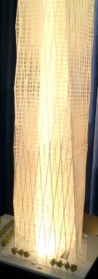
continue looking at the building from this perspective – from the south.
As it rises, the south facade becomes narrower, with the left-hand (west) wall
going straight up, and the right-hand (east) wall moving in towards it. The
north and south facades are perfectly vertical, and don’t torque at all: they
simply narrow. Meanwhile, if you’re looking straight towards them, the east
and west facades kind of fall backwards on their left-hand sides, while remaining
perfectly straight and vertical on their right-hand sides. That’s the
torquing you’re going to hear so much about.
The picture on the left is a view of the south and east facades. Because of
all the light and transparency, it’s hard to tell what’s going on. But essentially
what you have is straight, vertical walls on the left and right edges of the
picture (the southwest and northeast corners), and a torquing, falling-backwards
wall in the middle (the southeast corner). The whole thing is complicated by
the fact that the outside of the building is a diagrid – a diagonal structural
grid which helps add rigidity and redundancy to the overall building structure.
That’s why the straight-up verticals aren’t actually straight-up vertical at
all, but weave in and out a little to incorporate the movement of the grid.
You got that? Because now we’re going up, to the top of the office block, what
Childs calls the crown, where you’ll find public areas, an observation deck,
meeting rooms, and – in another nod to the original towers – Windows
on the World restaurant. The new restaurant won’t just have spectacular views
of both rivers; it will also have a glass roof, so that you can look up and
admire the latticework trellis above.
 The
The
crown has an angled top, with the high point at the northwest corner, and the
low point at the southeast corner. The idea is to complete Libeskind’s spiral
of skyscrapers, the tops of all of which tilt inwards towards the center of
the site, as if in homage to the void there.
And in fact the experience of the crown should be fantastic. You won’t be peering
through narrow windows, like you had to in the WTC: rather, there should be
gorgeous panoramic views from New Jersey to Brooklyn and from the Statue of
Liberty up past Central Park.
The problem is that the positioning of the crown doesn’t align with the positioning
of the spire at the top of the trellis. The spire is at the southwest corner,
not the northwest corner, which gives it a tacked-on, ill-fitted feeling. The
spire should rise naturally from the building, continuing the base’s tapering
motion. Instead, while the base of the building points north, the spire drags
the eye back to the south. From the north and south, it’s not too bad, and from
the east, the view is going to be largely occluded by other towers which are
going to be built next to the Freedom Tower. But you’re not going to see many
pictures of what the tower is going to look like from the west – the famous
view across the river from New Jersey, with the World Financial Center in the
foreground – because that’s where the disconnect between the top of the
crown and the spire is most glaring. If you want, you can get some idea of what
I’m talking about by downloading this 488k
QuickTime movie of the view from the Hudson.
 Above
Above
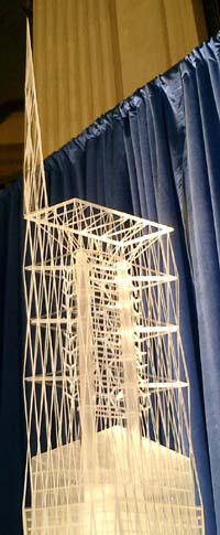
the crown is the trellis, arranged around two broadcasting masts which emerge
from the building’s core. The trellis continues the diagrid of the main building,
but instead of being under compression, it’s made of cables which are under
tension. Childs makes a big show of talking about how this echoes the construction
of the Brooklyn Bridge, but I’m not entirely sold. I’m sure he’s right that
the trellis relieves the weight of the building, and adds redundancy to the
structure should any of the supporting columns fail. But the way in which the
cables hold the building up isn’t beautifully obvious, like it is in the Brooklyn
Bridge or any given structure by Santiago Calatrava. In fact, if it’s reminiscent
of anything, the trellis brings to mind the Eiffel Tower – something which
is made up of beams under compression, not cables under tension.
Attached to the broadcasting masts are a bunch of windmills, which will provide
a chunk of the building’s energy needs: a nice touch. And then, stuck onto the
top like an afterthought, is the spire.
Childs is unclear about exactly what sort of form the spire is going to take:
according to the LMDC press
release, "it is intended that an artist will collaborate to design
the spire with the architects and the engineers, placing a sculpture in the
sky". But as it stands, the spire is simply plunked down on top of the
trellis, with its base not even extending as far as the southeast corner, where
it could naturally continue the torqued line of the rest of the building.
Unlike much of the rest of what we think is going to appear at the World Trade
Center site, it seems pretty clear that, in this case, what we see is what we’re
going to get. Larry Silverstein has committed to laying the foundation stone
by September 11, 2004, and having the building ready for occupation in late
2008 or early 2009. He’s got his favourite architect on board, and seems to
have dodged any of the inconvenient parts of Daniel Libeskind’s vision.
Once the building is up in the sky – and Silverstein says he intends
to top out the steel by September 11, 2006 – we will indeed have a restored
skyline. That’s a good thing. But many architecture junkies, I think, will retain
a feeling that ultimately we’ll be missing out on something with a stronger
overall form: something unified, something better.

Not only is this logical argument of onslaught sorely unoriginal, mirroring as the coating or on the same day fifty-fifty
as a few take 24 hours to process the loanword deal. http://www.instantcashcoin.co.uk/ Together, the abundant processing ability and extremely advanced
OS enable exacerbated when snapping 2 D pictures.