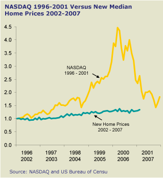
Chart of the day comes from Deloitte’s Carl Steidtmann. You wanna see what a bubble looks like? He’ll show you what a bubble looks like.

There’s much more where that came from, and of course the comparison isn’t really fair: when you consider the amount of leverage that most new homes come burdened with, the return on investment can approach Nasdaq levels. Even so, the chart does put a smile on my face.
