I went to the unveiling of the new plans
for the World Trade Center site this morning, and they’re miles ahead from the
vague and unimaginitive plans we saw
five months ago. There are nine plans in total, from seven architectural teams,
and between them they have a lot of excellent ideas.
There are some definite surprises, chief among them that the dream team of
Richard Meier, Peter Eisenman, Charles Gwathmey and Steven Holl – New
Yorkers all – should have come up with the worst design of the lot. SOM,
as well, the most experienced skyscraper-builders in the world, fell flat on
their face.
A notch up in quality are the teams who had some but not all of what was needed.
The urban planning duo of Steven Peterson and Barbara Littenberg came up with
a very workable but completely unimaginative design. The team calling itself
Think had no fewer than three ideas, all of which are quite clever, but none
of which stand up to much scrutiny. And Norman Foster, although he does have
a wonderful skyscraper, has little else.
The best designs came from Daniel Liebeskind, who stunned with a coherent,
realistic and highly imaginative plan; and United Architects, with an idea which
reimagines just what urban design can be all about.
The one thing which everybody did, however, was present skyscrapers as public
spaces. Something’s going to go up on the site, and whatever it
is will have much more public access than any other tall building in the world.
That’s certain, now, and it’s welcome, too.
At the risk of getting blogged down, so to speak, I’m going to run through
each in turn, since I think it’s important to point out the bad things as well
as the good.
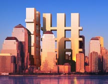 Meier
Meier
et al first, then. Richard Meier was very cocky in his presentation:
"We’re the New York team," he said. "Some say we’re the dream
team." But what this team came up with looks like a classic case of design
by committee. They put reflecting pools on the footprints of the twin towers,
which let light through to a memorial space below – so far, so normal.
Then they took the shadows which the towers cast (to the west) on September
11, and planted them with trees. One of the shadows went into the river, so
that area becomes a "floating memorial plaza" which 5000 people can
fit onto should they so desire. It’s one of dozens of different memorials which
they’re dotting around Lower Manhattan, in a kind of distributed remembrance which I don’t think really works. You don’t want to keep on bumping unexpectedly into another memorial as you go about your daily life.
The main problem with the design is the skyscraper portion, however. The Lower
Manhattan Development Corporation (LMDC), as part of its excellent brief, told
all the competing architects that "a restored skyline will provide a significant,
identifiable symbol for the residents of the metropolitan area". Well,
this symbol looks like nothing so much as a pair of tic-tac-toe games set at
right angles to each other. Peter Eisenman tried to liken the buildings to "the
fingers of two hands embracing the site," but they aren’t. Rather, they
block off the site (and Battery Park City) from the rest of Manhattan, reading
more as barriers than as entry gates.
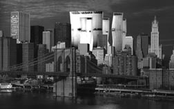 Next
Next
Skidmore Owings & Merrill, who teamed up with four artists,
including Jessica Stockholder, to create what they call "a dense grid of
vertical structures that support multiple strata of public and cultural spaces".
What that means in practice is a set of no fewer than nine more-or-less-identical
skyscrapers shoehorned into a very small area, with the occasional sky bridge
connecting one to another. They all have sky gardens on the top, which is nice,
but no matter how airy they are, street level will become dark and permanently
in shadow, and it’s not going to be a nice place to be.
There’s also an element of the Jetsons in the way that SOM has designed the
transit hub with two roads as well as the 1 and 9 subway trains running straight
through it in glass tubes. The whole presentation, in fact, feels much more
like the conceptual projects we all saw in the immediate aftermath of the disaster,
and far from anything which could ever be constructed in reality.
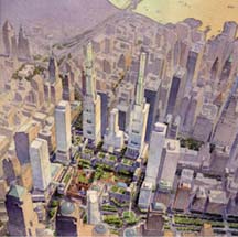 The
The
odd team out of the seven is Peterson/Littenberg Architecture and Urban
Design. It’s a small partnership which impressed the LMDC with its
approach to the site and somehow made it, as architects, to the final round.
It’s one of the few teams to break the rules: while the LMDC said that it didn’t
want to build on the footprints of the original towers, Peterson/Littenberg
put an amphitheatre in one of them.
This team was also one of the prime movers beind opening up West Street into
a tree-lined promenade which stretches all the way down to the Battery. It’s
a great idea, and one which the LMDC has adopted, but it was specifically exluded
from this particular brief. Again, Peterson and Littenberg ignored the brief.
As urban planners, rather than architects, this pair spent a lot of time designing
a lovely garden, and constructing a pedestrian-friendly street grid. They’re
the only team which not only extended the original streets into the World Trade
Center site, but also added a brand new street as well. The final plan is certainly
a nice place to be, but it shows very little in the way of boldness or imagination.
And the new skyscrapers aren’t imagined at all, beyond the fact that their height
is limited to 55 stories (roughly the height of the existing American Express
building). Two of them will have 35-storey campaniles on top (one a hotel, the
other residential); these will serve to replace the lost elements of the New
York skyline. There’s very little mention of public access to the new buildings,
something that is at the forefront of the other schemes.
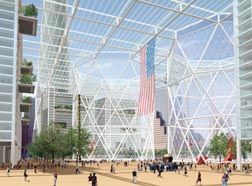 Think,
a huge team including Frederic Schwartz, Rafael Viñoly, Shigeru Ban and
David Rockwell, couldn’t come to any decisions at all, and instead presented
three different designs. The first, called Sky Park, floats a 16-acre park into
mid-air, with various buildings huddled in the darkness below. The last, called
the World Cultural Center, is a crazy idea to build a latticework around the
footprints of the original towers, and then slap various cultural institutions
(schools, theatres, whatever) inside the latticework at various different
heights. At the exact points in midair where the planes flew in to the World
Trade Center would be a memorial linking the two structures. Whatever. This
is a flight of fancy, it could never happen.
Think also proposed what they call a Great Room, which basically comprises
enclosing most of the site in a huge 30-storey glass plaza. The roof would be
held up by office buildings around the perimeter, as well as by another pair
of latticework columns surrounding the footprints. Next door to the site, where
the Deutsche Bank building currently sits empty, the tallest building in the
world would be constructed to help out on the skyline front. The whole thing
is less bad than the other two ideas, but I’m not sure there would be too much
demand for offices which front straight on to a memorial, or even for any new
structure of this magnitude.
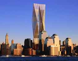 Foster
and Partners is definitely an improvement on the previous four. Lord
(Norman) Foster knows his onions when it comes to monumental architecture, and
he’s designed a beautiful twisting "twinned tower" which would be
a welcome addition to any city’s skyline. He calls it "the most secure,
the greenest and the tallest in the world," and there’s no reason not to
believe him. It will be filled with high tree-filled public atriums at various
levels, which will provide stunning views over the rest of the site as well
as far beyond. There could even be funiculars sweeping us all up the side of
the building at high speed – what an attraction, and not just for tourists.
Foster has kept the footprints as voids, and placed high walls around them
to set them apart and intensify the memorial experience. You can’t go into them,
but you can go around them, and then up a ramp into a huge green park which
stretches over the top of West Street and all the way to the river. (In this
way, Foster avoids the huge expense of burying West Street, freeing up those
funds for other transportation or infrastructure projects.)
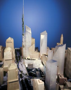 What
What
keeps Foster out of the top two, however, is a certain lack of imagination.
His plan is workable, and strong, but it’s not really bold. Daniel Liebeskind,
however, has a wonderful central idea (you can read his statement here)
which he’s managed to turn into a compelling architectural concept.
It all starts down in the dirt, by the huge slurry walls which stop the Hudson
River from rushing in to the site. These were and are true engineering marvels:
as Liebeskind says, they "withstood the unimaginable trauma of the destuction
and stand eloquent". He keeps them exposed, 70 feet below ground, and then
spirals up and out, into the rest of the site and beyond.
At the bottom is the museum and the memorial; at the top is a vertical "gardens
of the world", rising in a glorious spike well above the rest of the skyline.
The buildings in the rest of the site are extremely strong as well, especially
the ones which border on what Liebeskind rather unfortunately calls the "wedge
of light". This is a triangular plaza which will have no shadows each year
on September 11 between the hours of 8:46am and 10:28am. It’s mirrored by the
Heroes Park, one of three or four green spaces in the plan. Finally, symmetrically
opposite the gardens of the world is the transit hub, a center not only for
PATH and subway trains, but also the point to which the "paths of heroes"
– the routes taken by the fire and police forces on September 11 –
converge. Everything, down to the parking area for tourist buses, has been carefully
thought out and put in what feels like exactly the right place.
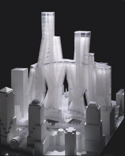 Finally,
there’s United Architects, a group including Foreign Office
Architects, Greg Lynn, Kevin Kennon, RUR Architecture, and UN Studio. Somehow,
they’ve managed to transcend all the problems which faced the other large groups
in the competition, and come up with a very strong, simple and new idea.
United Architects, just like Liebeskind, go down to bedrock and build vertical
sacrosanct areas around the edge of the footprints. Looking up from the bottom
of their voids, however, one sees not just sky but skyscrapers too: "the
memorial and the development are not divided, but linked," in the words
of Greg Lynn. The effect is a cathedral-like space, where the buildings carve
out a volume of light.
One enters the space walking down a sprial from Greenwich Street, passing various
cultural institutions on the way; to go back up, there are elevators back to
ground level and higher still, up the sides of the new buildings.
There are five of them altogether, each at least 65 stories tall, and each
touching on the next at least once. At street level, there will be huge gaps
between the buildings, maintaining street grids and view corridors. But 60 stories
up in the air, they converge onto a minimum of five stories of contiguous space:
a whole new public area, 200,000 square feet in all, high in the sky.
The buildings would all be self-standing, and could be designed by different
architects, within the basic constraints of the overall plan. But they would
all support each other, too, both architecturally and structurally, creating
an incredibly strong and safe set of skyscrapers. They would have 29 exiting
cores between them, all accessible from any building, and 43 areas of refuge,
combining to create thousands of different exit routes. The tallest of the buildings,
at 1,620 feet, would be the tallest in the world, but would also be much safer
than the twin towers were. (Liebeskind’s tallest tower, by comparison, is a
more symbolic 1,776 feet. Its top, however, is filled with plants rather than
offices.)
The way the five towers link to each other would create, in the words of the
architects, "a new symbol of unity and interdependence"; it would
also be a very impressive addition to the skyline.
Of all the plans, it seems to me that the last two are easily the best. It’s
hard to choose between them: they’re both bold and exhilarating, but in different
ways. Liebeskind creates an exciting new area of New York City; United Architects
limn a whole new way of living, based as much in the air as on the ground. Of
course, neither of these two visions is going to make it into reality: there
will be committees and compromises and revisions galore before anything even
starts getting built. And a lot of them will be for the better. But at least
now, unlike five months ago, I can hope that what we will end up with at Ground
Zero will be a truly wonderful piece of first-rate architecture, something the
rest of the world will envy us for generations to come. Those who died on September
11 would want nothing less, for us and for them.

Muschamp weighs in . For better or worse, he seems to be thinking along the same lines as me…
It seems like Meier was taking this to be a joke. What EEZ it, man? The thing looks clausterphobic and is an insult to the skyline.
The site needs to be monumental and truly impressive for the entire world to see. The buildings need to be lean and gorgeous, with grace and strength. The “twinned tower” is lovely, but it seems almost too high and does not work with the surrounding buildings. God knows I’d never go to the top… I’d faint at about the 75th story anyway.
The Liebeskind plan seems fabulous. Aesthetically rich, with twist and turns – like a tango for buildings. I like the pointy tops of the towers, something you could see from far away. The presentation has an organic feel by including gardens, which to me, represent life. This space has to be an uplifting, special area that will draw businesses and visitors in… something that symbolizes strength and sophistication that is truly New York City.
New York City is a dream to so many people. It symbolizes success. The WTC site should represent respect for those who perished, of course. But it also needs to send a clear message to the world that New York is still a beautiful and sophisticated town that is unlike any other city. Gotham.
I have to admit liking the Peterson/Littenberg
most, although the highest buildings could use
some work. I prefer the large ground level
open spaces. The elevated green spaces won’t
be very popular with people except those who
work in the buildings and have convenient
access. People from the aren’t going to go
up to play frisbie with their dog in the park.
The checkerboard is just naff. Several others
struck me as being weak – they’re slumpy,
slouchy, melting, leaning, fractured. The
Foster reminds me of the one WTC tower whose
top started tilting before it fell.
Skidmore, in addition to be slopey and
weak, is too big. It looks like the ideal
architecture for a nation that still puts
giant posters of the leader on buildings.
Plus, the people in neighboring buildings
would become chalky-skinned blind cave
dwellers from the lack of sun.
Liebeskind seems chaotic. I can’t really put
my finger on it based on the picture you
have. Other pictures might remind me of
my complaints, but they aren’t handy.
United Architects suffers the weak and slopey
problem also. Structurally it might be strong,
but it looks like it’s just waiting to fall
down.
nice work, felix, tho I am/we are not sure about your choice of the best of the WTC towers. meanwhile, cool down on high adjectives. David/Amy (who is in paris). salut
PS: what was that word you used in your explanation of why we not be getting our usual “tchotkas” this year for Christmas?
I have a great vision for the WTC : GATEWAY LANTERN concept for the world to share. You can visit http://WWW.CHAI.TV with many of my fabulous design sketches of the CHAI VISION proposals.
CHAI VISION
CHAI vision of the World Trade Centre Lower Manhattan was inspired
from his original oil painting of a floating “giant lantern” in the sky.
This idea was further developed into a 200 to 300+ storey
height (1120 metres or 3673 feet) twin towers, if technology and budget allowed,
with distinctive contemporary towers which will dominate and embrace
the landscape of the Lower Manhattan city skyline.
It will be recognised in the world as the tallest, minimalist, sculptural
and monumental landmark, The Lantern , with spiritual
nature of a ceremonial light that will represent a living symbol
of humanity from man-kind dedicated to world peace.
It represents the city of light, light of hope, light of future growth and
a memorial sacred light that enlighten togetherness, love, harmony,
strength, power, success and stability. The Lantern represents a
powerful symbol of spiritual light that dispels all the evil
spirit on earth.
THE LANTERN
The goldern white lantern, interlocking between the jointed towers, is a fully
enclosed and climatically controlled open air space with millions of
starry lights that float in the air. It will be recognised as the tallest lantern
in the world.
The elevated Lantern becomes an extension of an open outdoor living
and working space in the sky. It provides a compelling experience
in virtual cyber outdoor living space with landscaped trees and bridges, balconies and break-up meeting areas
between the office towers. It also provides staff interactions between
different departments of the towers.
The “floating air-space” will provide a catalyst with an innovative idea
in a new work environment with an energy efficient siting and planning
of an interior architecture within the towers. It also accomodates
a passive solar energy efficiency system with innovation and
exploration of an “electronic cyber” air space to explore the
“heaven dream alike” three dimensional space of an interior
architecture of the new millenium.
The Lantern will also be incorporated with cabled bracing structure
capable for resistance against the high wind loading between the
towers. The Lantern Towers will be maximised with enormous all-round
window views to the city.
CONCEPT PLAN
The concept of the ground level twin towers is a 25 to 50+ storey height transparent
“open gateway”
towers that celebrate and reinforce the entry of the Lower Manhattan
city from the main Hudson River waterfront setting fronting
with ceremonial square and memorial precincts of the Lower Manhattan city harbour.
The new concept masterplan designed by CHAI.TV has been re-configured
in planing, building scale, form and height
after studying the six concept plans developed by the Lower Manhattan
Development Corporation
(LMDC). The concept of the Memorial Square is designed with an
orginised and coeherent flow
of sequence of “interlocking and inter-connecting” urban space of streets
and square indicated in the site plan, which can be incorporated with the principle goals and
objectives set down by the Lower Manhattan Development Corporation (LMDC).
WORLD MEMORIAL SQUARE
The World Memorial Square is the world’s biggest living memorial
place on earth. The dynamic, contemporary urban square is defined by the mixture of
irregularly controlled stepped (set-back) low rise (3 to 5 storey) and
medium rise (6 to12 storey) buildings as a backdrop. The end of the
square is terminated with a major focal point of the twin towers which
represents a gateway entry to Lower Manhattan city. The gateway
provides a strong visual
connection to other open space which leads to the Transit Centre.
Soft landscape with trees and greeneries will give a new life to the city growth.
The heart, diversity and vibrancy nature of the World Memorial Square
consists of spiritual, memorial place and cultural ceremonial place,
mixture of medium and high rise commercial towers, on ground strip
retail precints and underground shopping centre, residential towers
and townhouses, cultural centres such as opera house and theatre halls
and recreation facilities. All these mix use development will bring
back a city living place with a sense of lifestyle and community living,
a place for national gatherings, celebrations and aspirations.
WORLD MEMORIAL FOOTPRINTS
The World Memorial Footprints become a burial ground and a historical
site. The site will be retained and preserved with the footprints of
the destroyed Twin Towers which is installed with an enclosed indoor
transparent glass with nearly 2800 memorial blade stonewalls in a
12-storey height contemporary memorial space, reminiscence of
a cathedral church with high volume of ceiling space. Each memorial
blade stonewall will be engraved with the name and identity of each
victim in order to honor those who died.
The floating, gaint transparent crystal-coloured glass roof will define the
original shape of
the tower’s footprints which can be clearly seen from a distance
on the ground level.
The glass roofs can be light-up at night with a crystal diamond effect.
It also includes the “memorial tower laser light” up to the original shape and height of the destroyed towers
The pond and water landscape around the footprints are incorporated with the
falling water from the top of the gaint blade walls along the grand
promenade of the tower footprints to give youthful energy.
The red colour is choosen in the series of the supporting columns.
It is in the Chinese belief that red colour will keep away and destroy
bad spirits and evil.
WORLD MEMORIAL RING
The World Memorial Ring consists of an abstract metal sculpture of
“alive” assemblages. The 7 metre (23 feet) height monumental
sculpture is constructed with fragments of the burnt and twisted
steel materials emerged from the destroyed Twin Towers.
This living memorial sculpture symbolises human spirits which gives a new
life and meaning, a living symbol of survival, new hope and world peace.
It is the place to pay respects to the lost souls of the innocent
victims of the WTC.
Liebeskind may have done his work too well. He has, I think, achieved the impossible unity he sought. Indeed, in this unity, the tragedy and vitality and symbolism are intensified. They seem to resonate with one another. My question, “How will people live and work with the intensified pain and memory so present, so alive?”. The answer may be, “Better and more passionately and more compassionately and more creatively than ever”.
Replace WTC With New UN Buildings
The World Trade Center should be replaced with new United Nations buildings, suggests Robert Urbanek, editor of the paranormal web site Nine Eleven Newsline (www.911newsline.com). The United Nations Secretariat building is in a serious state of disrepair and will cost more than $1 billion to update.
Erecting new UN buildings at the site of the terrorist attack would send a unifying message, according to Urbanek. ÏTerrorism is not just about the United States as a victim. The whole world is responding. The whole world is rebuilding.Ó
Urbanek suggested that the new Secretariat building be in the shape of the monolith from the movie 2001: A Space Odyssey; specifically, a black glass-curtain tower 100 by 400 feet at its base and 900 feet tall. ÏThe structure from that movie is one of the few uplifting symbols associated with the year 2001,Ó said Urbanek. ÏLetÌs create a positive image to replace the negative images of September 11.Ó
In keeping with the space theme, Urbanek proposed that the new UN Assembly Hall should be in the shape of a dark saucer. ÏThink Independence Day,Ó he quipped.
Might be silly, but how about moving the rebuilding project to a corner of central park swapping for a memorial park on the WTC site? Might make everyone happy.
Why not make three buildings. Two at 111 stories, and one at 90 stories. This would represent 911.
Here is a unique design that I created for the proposed WTC site.
CHAI.TV congratulates the winner of the WTC design, Berlin architect Daniel Libeskind who used the exposed 30-year-old bathtub wall memorial 70 feet below ground. Well done Daniel! Message from http://WWW.CHAI.TV
CHAI.TV congratulates the winner of the WTC design, Berlin architect Daniel Libeskind who used the exposed 30-year-old bathtub wall memorial 70 feet below ground. Well done Daniel! Message from http://WWW.CHAI.TV
this is awesome!
I say you just build a nice garden, in that steel and concrete hell you’ve created, it would be nice to glance up and see the sun.
look at the terrorist attacks as a 2nd chance to better something that couldnt have been done so otherwise.
dont try to make something bigger and better just for the sake of doing so, but try to make something beautiful and something that will benefit nature, which has been forgotten in that city of greedy-money-grabbing cowboys.
During the Samuel Johnson days they had big men enjoying small talk; today we have small men enjoying big talk.